SELECTING THE RIGHT PAINT COLOR PALETTE FOR YOUR HOME
The psychology behind color
Color has been found to impact a person’s attitude and emotions. The way you use color can promote a sense of positivity and well-being, while the “opposite” color can also conjure feelings of depression. It should also be noted that those perceptions can also be individual and based on previous experiences related to that specific color.
Generally, there are specific colors that evoke certain emotions and some that suppress them. For example, blue and green give off a peaceful, calming effect while red, being a bright and energetic color, tends to induce anxiety and a sensation of being overwhelmed.
Darker, softer shades can be used to provide a relaxing environment and are great for creating a steady sleep cycle, like a veil that separates us from the chaos around. Warmer colors generate energy and stimulate brighter, happier feelings.
Think about the emotions you want to evoke and which colors would pair well together to bring out those emotions.
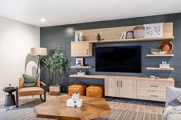
This is a great example of how the colors can contribute to the unique feel of a space.
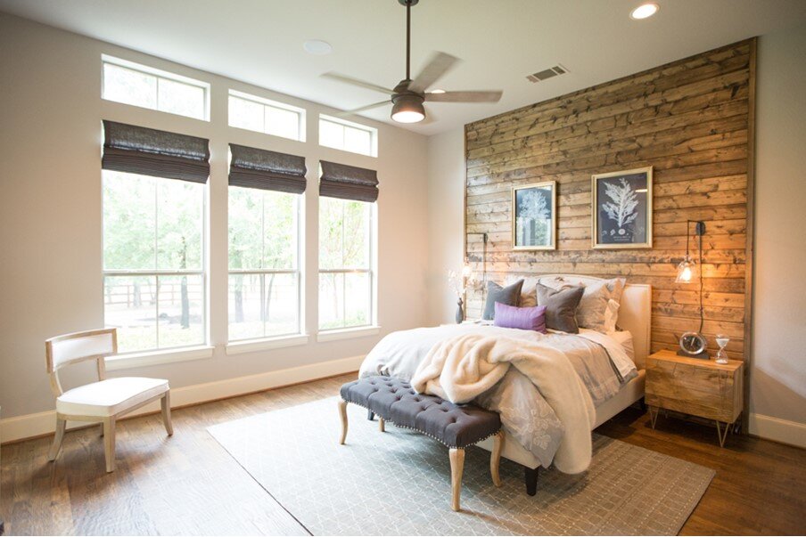
Look around your home
It may seem simple, but the first step to choosing any color palette is to take a look around each room and take the time to notice some of the permanent features in your home. Take note of the colors used for such things as floors, doors, fireplaces, staircases, and windows. Ask yourself, do I plan on making permanent changes in the future?
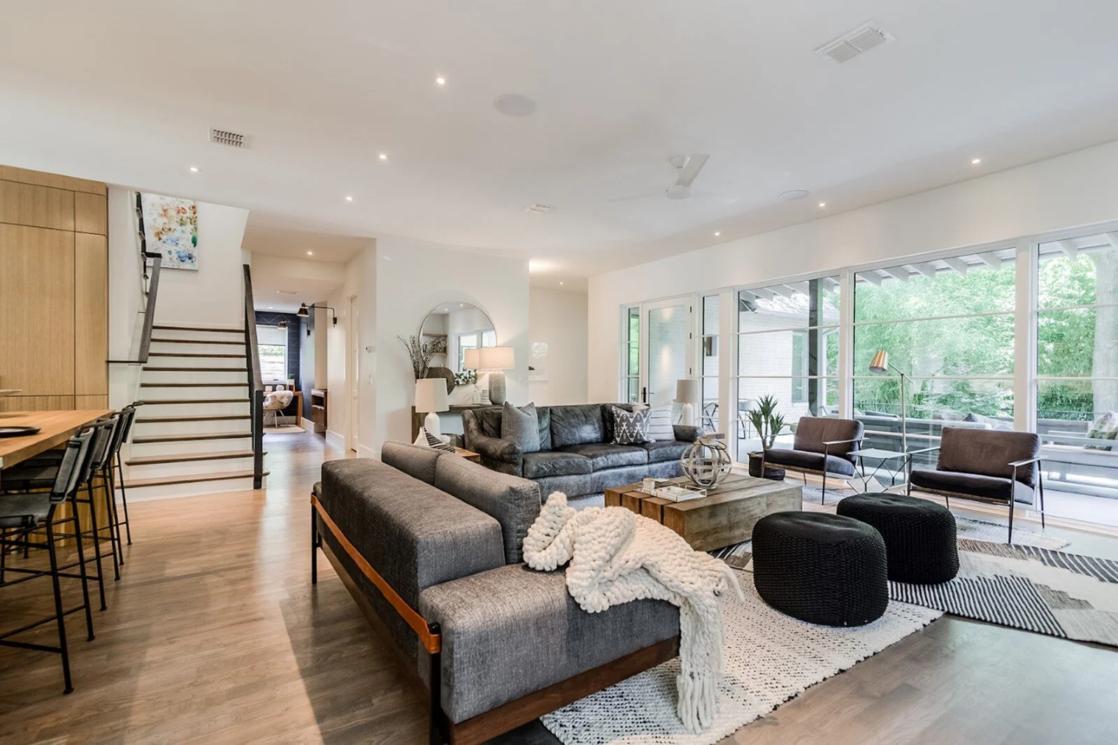
As you can see in this photo, the paint color pairs really well with the natural lighting from the large windows and hardwood floors.
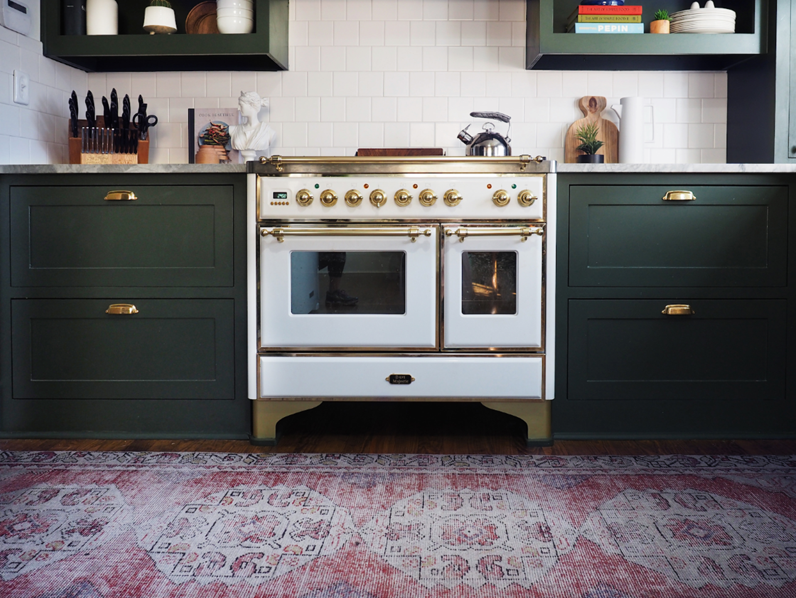
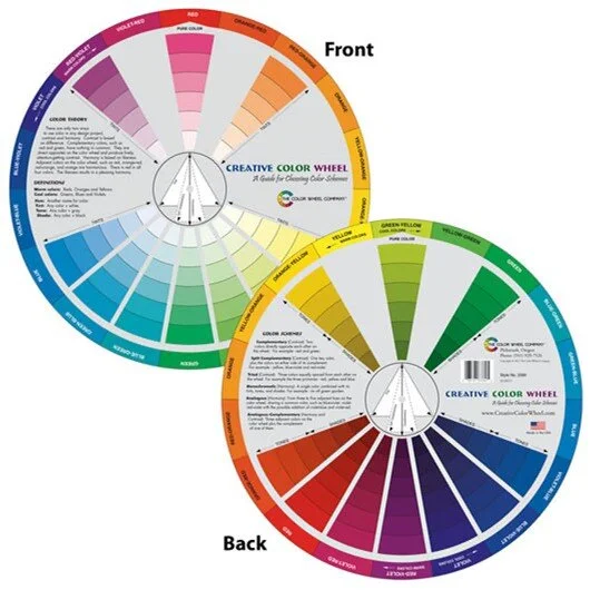
Use a color wheel
A color wheel is a useful tool while finding those colors that compliment your chosen fabrics and furniture. The colors that are opposite of each other on the color wheel are complementary colors, which means that they are completely different from each other but highlight the features of colors opposite of them. An interior design firm uses those complementary colors to highlight style and proportions in the spaces.
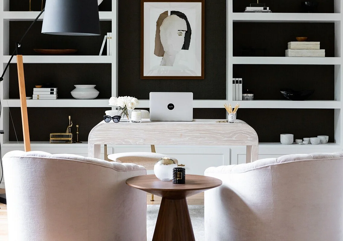
Pay attention to lighting
Lighting is a very important component when determining a wall color. If you have an abundance of natural lighting, your colors will look the closest to what you want them to look during the day. Be mindful of the time of day that you plan on using each room, as natural light will have no effect at night. The different color temperatures of your bulbs will also have a big impact on the general hue of your home and can change the overall tone and saturation.
In this space, warmer lighting is being primarily used to elevate the warm and cozy feeling you would normally have in a bedroom.
Paint last
Choosing your paint color should be a final step in the design process. Find your furnishings and decor, fabrics, and textiles and then observe and contemplate how they all come together with that paint color you have in mind. Look for things that you might want to take out because they pop too much or too little, or the mix of colors that don’t blend well together.
It would be much more difficult to change anything after the painting process including the extra work.
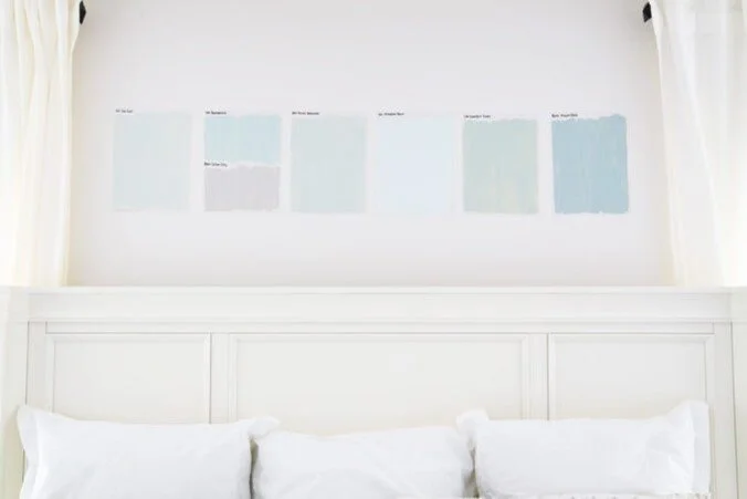
Always test your paint color before going all-in
Be sure to order many paint samples, that way you can adjust the shade you’re looking for until you get the right one. Test your favorite samples near all of your light sources to get a better well-rounded feeling of what each color will look like throughout your home.